Purpose
The purpose of this blog is to provide practical guidance for establishing and using a monitoring baseline to provide visibility into IT systems’ health and performance.
Target Audience
This blog is targeted primarily toward an IT operational audience who is responsible for providing ongoing operational support and management for a typical IT environment, including monitoring and reporting.
Introduction
“Why weren’t we alerted about this ahead of time?” This question (or some derivative) is easily in the Top 5 questions I have repeatedly heard throughout my career in consulting and in managed services. Monitoring and alerting seem to consistently pose a significant challenge for most IT organizations, and many organizations struggle with several seemingly dichotomous challenges such as achieving end-to-end visibility vs. deep visibility in some areas but relative obscurity in others, monitoring infrastructure but having limited knowledge of the user experience (UX), and often having a lot of (perhaps too much?) metrics/data but no context.
Certainly, these are not easy challenges to solve, and like all things IT, it takes proper planning, design, etc. to establish a solid monitoring solution that meets the needs of the organization. In this blog, we will provide practical guidance on how to address some of these challenges based on field experience and technical expertise. Note that this blog is primarily written from the perspective of Citrix monitoring, although the concepts are applicable to monitoring non-Citrix components/environments.
Metrics That Matter
As with all things, the first step is to identify requirements; in this case, what we refer to as the metrics that matter. This is key, since there are a ton of metrics that can be captured, so the real task is to identify only those metrics that are truly important. We have observed that a common approach is to ask each IT area (e.g. storage, networking, directory services, databases, etc.) to define their list of metrics, and then combine all the metrics to provide visibility into the overall environment. This does work, although in a real-world situation it often happens that an issue occurs to impact users; however, the metrics for each individual IT area are all “green” (i.e. the monitoring metrics show no indication anything is wrong, thus IT is not aware until users report issues).
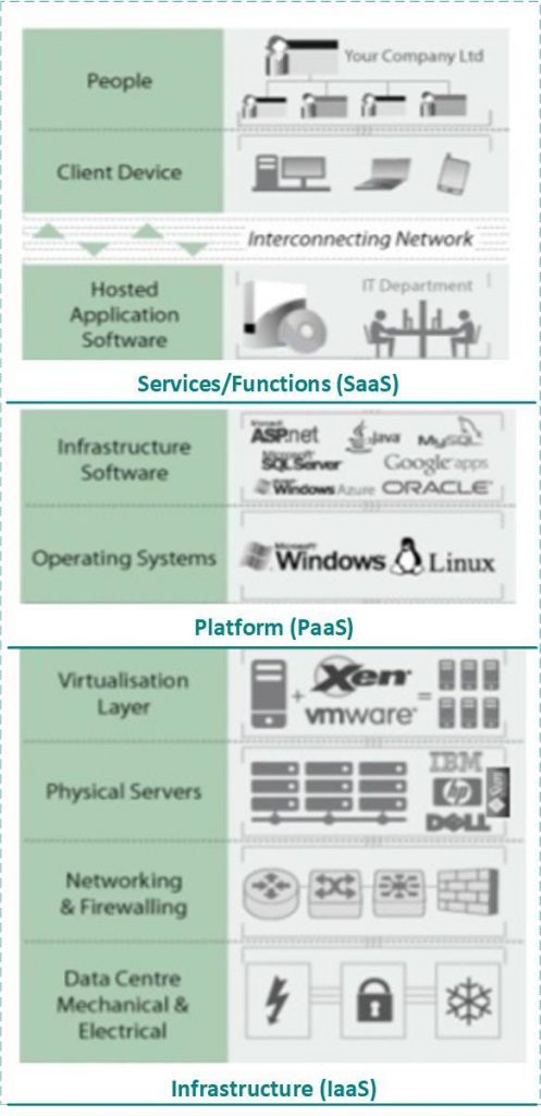
To address this common challenge, we like to start by listing the services/functions that are used by the user community (e.g. connectivity, authentication, application access, etc.), then identify the systems that work together to enable these functions (e.g. firewall, WAN, AD, etc.), then identify the metrics that indicate the health and performance of these systems. A key here is to also monitor the overall end-user services/functions, which typically requires a monitoring tool that enables synthetic transactions. This is often facilitated by organizing systems into traditional categories of infrastructure (IaaS), platform (PaaS), and applications or end-user services/functions (SaaS). Then for each category (service layer), identify the key services/functions that are consumed by end-users; note that typically (but not always) the SaaS layer delivers end-user services/functions, and the underlying IaaS and PaaS layers deliver sub-services to the layer above, as illustrated in the following diagram.
In addition to the abovementioned objective metrics, we also like to capture subjective feedback; one simple method involves surveys. An end-user survey may be distributed to capture end-users’ subjective feedback regarding their experience with using IT systems to do their daily jobs. The survey should be short (<10 questions) and should consist of multiple-choice questions (not freeform) so answers can be captured and stored in (for example) a database, which facilitates repeating the same survey in regular intervals (e.g. semi-annual) and comparing answers to spot trends/patterns (we use a 6-question multiple-choice survey designed for Citrix environments, with multiple-choice A-D answers organized to facilitate being able to easily spot poor, neutral, or positive trends). This is important, as it enables us to marry subjective feedback (end-user perceptions) with objective metrics.
In summary, two key takeaways from this section are:
- Monitor the overall end-user services/functions, not just the typical “traffic light” metrics associated with common IT components.
- Periodically capture subjective feedback and marry it with objective metrics.
Design A Solution
Once the metrics that matter (requirements) have been identified, a good next step is to design the appropriate monitoring solution. During this phase, many organizations tend to inventory the in-house monitoring tool(s) to see which tool(s) can be used to monitor the end-user services/functions and metrics that were identified during requirements gathering. Then a decision is made regarding whether the monitoring requirements can be met using only in-house monitoring tools or if the organization needs to invest in a new monitoring tool(s).
Once the monitoring tool(s) has been identified, a good next step is to document the monitoring tool that will be used to monitor each end-user service/function and metric. This often results in a list of functions and metrics that indicate some functions/metrics for which there is no monitoring tool; i.e. functions/metrics that apparently cannot be monitored. At that point, the organization can decide to accept the risk or determine how to monitor a particular metric(s), but the key is that it is a conscious decision rather than an oversight.
Once this list has been documented, a good next step is to define the metric threshold values (typically, yellow and red thresholds for warnings and errors, respectively), and the list of alerts that will be triggered if such metric thresholds are exceeded. When defining alerts, it is imperative to avoid creating alerts that over time will come to be considered white noise; thus, it is typically useful to categorize them as follows:
- Information – these alerts inform of an event that occurred or of other data that is good to know about, but do not warrant immediate/follow-up action.
- Warning – these alerts warn of an event that has occurred that often indicates (symptom) an issue or other more serious event may be about to occur; these alerts warrant investigation.
- Error – these alerts inform that an issue has occurred, a component has experienced a process or service failure, etc.; these alerts warrant immediate corrective action.
These are all necessary steps, and many organizations often exit the design stage at this point; however, it has been our experience that this is also a good time to define how the monitoring solution fits into the organization’s overall Event Management process (from an ITIL perspective). Event management defines and governs monitoring tool configuration, baseline creation and management, alert definition and response, report types and content, integration with other operational processes, and related roles and responsibilities. In absence of such a process, taking only a few key steps can often be very beneficial (for organizations that have a mature event management process, these tasks are typically inherently performed as part of monitoring design), as follows:
- When documenting the alerts, also document the response action (i.e. the action that should be taken if/when a given alert is triggered), the team(s) that is responsible for taking action, and the team(s) that is notified (these last two items are from a RACI perspective, for purpose of identifying the team(s) that is responsible, accountable, consulted, and informed).
- Determine how alerts will integrate with the organization’s Incident Management process. Typically, information alerts are often queued in a repository that can be referenced for analysis, etc. but is not necessary for immediate action. Warning and error alerts typically integrate into the Incident Management process by being used to auto-create an incident ticket in the organization’s ticket management system. Typically, such an incident ticket defaults to a Sev3 (on a scale of Sev1-4), is triaged (investigated) and reclassified (if necessary) by the Service Desk, and is then addressed via the Incident Management process (which may extend to Problem Management, if it is found that an alert(s) is related to a problem).
- Determine how alerts will integrate with the organization’s DevOps function, for the purpose of defining and implementing an automated response to key events that trigger alerts (e.g. an alert that informs of a Windows service failure may attempt to automatically restart the service).
The monitoring design should also define how a baseline will be established, reported against, maintained, and (over time) re-evaluated as necessary. To determine a baseline, one simple technique we have found effective (especially when taking a UX-centric approach) is to set threshold values based on what constitutes a “known good” user experience (UX). This essentially involves marrying objective metrics with subjective user feedback. To do so, based upon answers from end-user surveys, note if the overall trend reflects a poor, fair, or good user experience. Overlay these trends onto objective infrastructure/user-experience metric values, with the goal of organizing objective metric values into category ranges of poor, fair, and good values so that a range of metric values can be used to indicate a poor, fair, or good user experience. For example, a “poor” metric value range may include CPU and memory greater than 95% (>95%), a “fair” range may be 80-94%, and a “good” range may be less than 80% (<80%). Note that this is an overly simplistic example to illustrate the concept; this approach should be used to determine the baseline for all key metrics (e.g. disk queue length) and functions (e.g. user logon duration). This exercise should be repeated whenever a user survey is captured, so the baseline is refreshed and maintained over time, with the goal of being able to use objective metric values as a fairly accurate barometer of the likely user experience. This should be supplemented by running synthetic transactions (scripts) that are regularly initiated/performed by the monitoring tool(s) to perform various end-user tasks to validate that key end-user services are online/available (e.g. launching a Citrix Gateway session to open an application or VDI).
To summarize, the key tasks in this phase are:
- Inventory in-house monitoring tool(s) to see which tool(s) can be used to monitor the end-user services/functions and metrics that were identified during requirements gathering.
- Document the monitoring tool(s) that will be used to monitor each end-user service/function and metric.
- Define metric threshold values (typically, yellow and red thresholds for warnings and errors, respectively), and the list of alerts that will be triggered if such metric thresholds are exceeded.
- Determine how alerts will integrate with the organization’s Incident Management process.
- Define how a baseline will be established, reported against, maintained, and (over time) re-evaluated as necessary.
As well, a summary of key outcomes from this phase are:
- List (e.g. spreadsheet) of end-user services/functions, metrics, yellow/red thresholds, alerts, alert category, alert response action, teams that are notified and are responsible for taking action if/when an alert is triggered, and the monitoring tool(s) that is used to monitor each metric and end-user service/function.
- List of alerts that will auto-create incident tickets in the ticket management system, and decision regarding the specific incident severity (e.g. Sev3). Also indicate the specific queue in which such incident tickets will be created (e.g. an “Events” queue wherein the organization’s Event Manager can investigate/triage and re-assign such tickets to the appropriate team’s queue).
- End-user survey that will be used to capture subjective end-user experience (UX) feedback (ideally, this would be a multiple-choice survey).
Monitoring Configuration
Once the monitoring solution has been appropriately designed, the monitoring tool(s) can be configured using the design as a blueprint. The key tasks of this phase are to configure the monitoring tool(s) to monitor the objects/counters (metrics), metrics thresholds, alerts, etc. The outcome of this phase should be a working monitoring solution that is used to monitor the health and performance of the environment, trigger alerts when necessary, and auto-create incident tickets for alerts categorized as warnings and errors. Since this phase involves hands-on-keyboard configuration/implementation of the monitoring solution, this phase may also involve the selection of a new monitoring tool(s) if the monitoring/alerting requirements cannot be met by existing in-house tools.
There are a lot of monitoring tools available, so the monitoring tool(s) is driven by the ability of the tool to meet the requirements of the monitoring design. Within Ferroque Systems, we use ControlUp, as it integrates directly with Citrix technologies (including Citrix Cloud and NetScaler), hypervisor platforms (VMware, Hyper-V, Nutanix, etc.), public clouds (Azure, AWS), and traditional infrastructure components. ControlUp also has a healthy after-market community that has developed an extensive library of available scripts to automate many tasks and extend the monitoring capabilities, and integrates with various ticketing systems to auto-create incident tickets and generate email alerts.
The specific actions/tasks required to configure the monitoring solution will vary depending upon the monitoring tool(s) that is being used. The monitoring tool(s) implementation should be documented to maintain as-built configuration documentation, as we have observed that it is often just as important for organizations to be informed of what is being monitored as it is to know what is not being monitored (to maintain an accurate accounting of overall risk exposure). Ideally, documentation would include a tree view of all systems that depicts the line of sight from end-user services to individual IT components. This does not have to be a massive physical diagram, but should at least indicate key 1:M relationships wherein if one component experiences an outage then many other components/services would be impacted. The goal is for the organization to be aware that if (for example) a file server goes offline, to be able to “walk the tree” to identify other (typically “up the tree”) components/services that would experience service degradation or outage. Many monitoring tools do this automatically by attempting to auto-discover components in the environment, although there is almost always some level of manual tweaking necessary to improve accuracy.
An important point here: to make the solution more comprehensive, the ultimate goal should be to link the monitoring solution to key business functions. For example, the above paragraph suggests the ability to “walk the tree” to identify services that would experience degradation or outage if a low-level component were to go offline; ideally, such services should include key business functions, such as supply chain or HR functions, which can then be linked to business functional owners so the right person(s) can be notified of a potential degradation or outage of the particular business function(s) for which they are responsible.
Once the monitoring solution has been configured, before this phase is considered complete, the solution should be tested to validate the right components and services are being monitored, metrics threshold values are accurate, alerts are firing as expected, etc. This often involves tasks such as taking a server offline, failing a Windows service, bringing a Citrix Gateway site offline, etc. so it should be planned so as to minimize the potential for end-user disruption.
Establishing A Baseline
Once the monitoring solution has been configured, it is a good practice to let it run for 4-5 weeks so the organization has an opportunity to verify the solution is functioning as expected and understand the level of fine-tuning that may be necessary to minimize white noise. During this time, the end-user survey should be distributed, and user feedback should be collected and reviewed; such feedback should be processed by/before the end of the initial 4-5 weeks after the monitoring solution is deployed (so that it is available when it is time to define/establish a systems health and performance baseline).
The goal of a systems health and performance baseline is to provide a benchmark for comparison that allows IT to have visibility into if/how much ongoing systems performance may improve or degrade over time, and the benchmark should be directly linked to the end-user experience (UX). A baseline should represent a “known good” performance level, to allow IT to use objective metric values as a fairly accurate barometer of the likely end-user experience, so IT can take appropriate (and ideally, proactive) actions to manage the environment to maintain a consistent user experience.
To set the baseline, IT should analyze feedback from the end-user survey and adjust yellow/red metrics threshold values for target metrics up/down or leave them as-is. In situations wherein survey feedback indicates a poor user experience due to sluggish performance (a very common scenario), it may not always be possible to add capacity to improve performance. In these situations, one technique we have observed is to set aside 2-3 Citrix servers (VDAs) to allow slightly fewer users/servers in an effort to determine how many users can be comfortably supported before users begin to notice a performance impact (note that these numbers may vary depending upon the applications/etc. being hosted). Once this users/server number is determined, capture the values for the metrics being monitored and use those values as the baseline values. Then return the servers to normal use (which should show that metrics values exceed the baseline, and will continue until such time as additional capacity becomes available).
Going forward, the baseline should be re-evaluated annually (e.g. by sending the same end-user survey to compare feedback to previous survey feedback, and adjusting metrics threshold values accordingly) or after a significant upgrade or new systems deployment (e.g. after upgrading the Windows OS, as newer OS’ often consume more compute resources thus end-users’ perception of performance may decrease if capacity is not also increased). Once established, the baseline should be included in reports and when reviewing metrics for historical analysis, to provide context for the metric values (absent such context, it is often difficult to determine whether the values being viewed represent an improvement, degradation, or status quo).
The key outcome of this phase is the establishment of a systems health and performance baseline, and of a process for ongoing periodic maintenance and re-evaluation/adjustment of the baseline over time.
Correlating and Reporting
Aside from enabling advanced warning, the core usage of a monitoring solution is to generate reports that depict the overall health and performance of the environment. Across popular monitoring solutions (such as ControlUp, Goliath, SolarWinds, etc.) the various reporting possibilities are endless and beyond the scope of this blog; instead, this blog will focus on a few of the reporting techniques we have observed to provide additional insights.
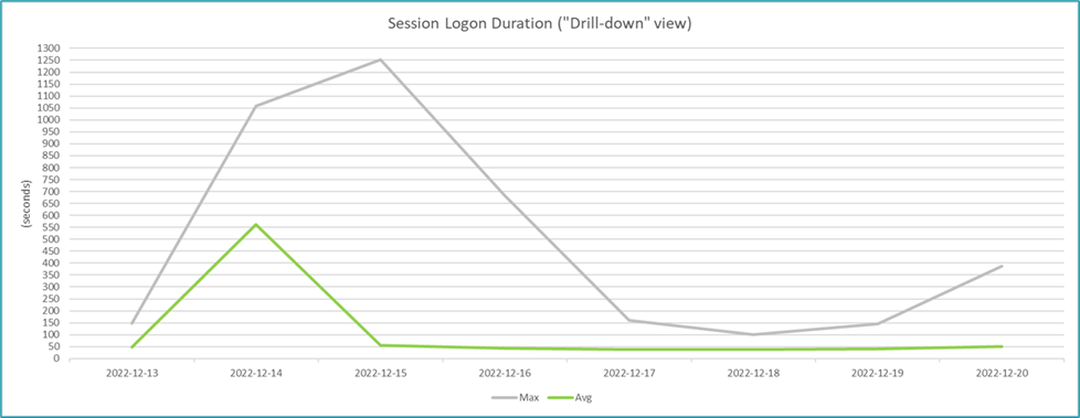
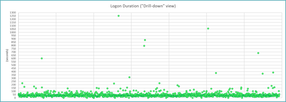
One technique is to export data to Microsoft Excel, and then leverage Excel to massage/organize the data in ways that facilitate easier analysis and provide insights not typically available via common canned reports. For example, reporting on Citrix logon duration is very common and is most often represented as a line chart, which is certainly useful. Beyond that, we have also found it insightful to use a scatter chart to visually depict individual session logon duration values relative to the average logon duration, so it is easier to see the percentage of sessions that experienced a logon duration closer to the average logon duration versus closer to the maximum duration, and thus which values may be considered normal vs. anomalies. For example, the line chart below illustrates a typical logon duration chart and clearly shows there were instances of excessive logon duration; however, it does not inform as to how many instances of excessive logon duration occurred, which is better indicated via the ensuing scatter chart (which clearly depicts several outliers but that the vast majority are clustered around the 50-sec range).
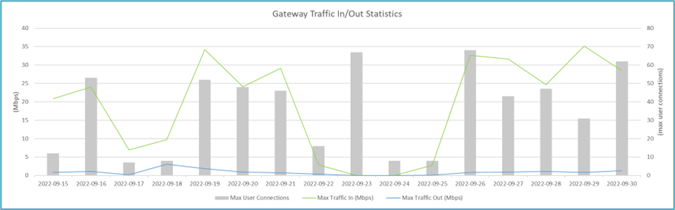
Organizing the data in Excel also enables the ability to create charts that would not otherwise be possible via the majority of default reporting tools, and also allows techniques such as plotting metrics on a secondary axis to make it easier to show correlations between multiple data sets, as illustrated in the following example chart for Citrix Gateway.
Another important (but often overlooked) technique is to create reports that speak the language of the business (i.e. not just reports for an IT audience), by tailoring report content to resonate with business functional leaders. For example, a traditional monitoring report shows a line graph of CPU, memory, and similar values, but most business leaders will not be able to draw meaningful conclusions from such reports (any more than an IT administrator could draw meaningful conclusions from a business report showing the cost/widget and how many widgets/week were produced). As previously mentioned, context is key to creating compelling reports. Thus, rather than show traditional “traffic light” line graphs, such monitoring reports should be tailored to resonate with business leaders by (for example) including content that indicates compute resource consumption on servers that host Supply Chain applications is holding steady and can accommodate two more users before additional funds will be needed to add one more server, and it takes approximately two weeks to procure and stand up new server hardware. Now, the Supply Chain business leader can refer to her product sales forecast to determine if she may need to hire more staff, and can inform IT in advance to ensure capacity is available for additional staff. This is an oversimplified example, but it illustrates the concept of how proper reports can facilitate business leaders’ ability for better planning and decision-making.
An additional technique is for reports to include baseline, yellow, and red threshold values on charts, to provide context so the audience can better understand if the metrics represent an improvement, degradation, or status quo. For example, on reports that contain line charts, the baseline value and the yellow and red threshold values could be represented as dashed lines at the target values on the Y-axis.
These last two techniques highlight an important concept: monitoring reports should provide information, not just data. Per ITIL, there are four layers: data, information, knowledge, and wisdom (DIKW). Data is just raw data, which is useful but not necessarily insightful unless the audience already has a solid understanding of the data. Highlighting data relationships, making correlations and conclusions, etc. provides the report with information. For example, the logon duration charts above provide data; including corresponding content using language that resonates with the business provides information (as in the simple example above); and leveraging field experience to add content that provides thought leadership (guidance) regarding how to decrease the logon duration for those instances of excessive duration provides knowledge. As a general rule, reports should at least provide information, not just data, and should strive to provide knowledge whenever possible.
In Conclusion
There is a lot of readily available online content that provides a comprehensive walk-through of how to implement basic monitoring, alerting, and reporting; this blog assumes core knowledge of such tasks and instead focuses on several key techniques to enhance the process of defining and implementing an effective monitoring solution, establishing and maintaining a baseline that is directly linked to the end-user experience, and creating insightful reports that resonate with the target audience, with the ultimate goal of providing better outcomes. We often have and do use these same techniques within Ferroque Systems, and hope that sharing them here provides insights that can help organizations to enhance their monitoring solution, whether doing a complete monitoring revamp or seeking marginal gains for an existing solution.